
Animal Crossing
Gaming UX/UI Case Study

Task: UX/UI Design
Tools: Figma, Figjam, Photoshop
Project Length: 4 weeks; 4 hours a week
Overview
Improving usability while keeping the game's charm.
This project explores how subtle UX and UI adjustments can enhance the overall player experience in Animal Crossing: New Horizons. By redesigning small interface elements and streamlining key interactions, I aimed to improve usability while preserving the game’s charm and relaxing gameplay flow.
Challenge
Identifying usability gaps.
- Uncover specific UI pain points in the original game screens that hindered efficiency and clarity.
- Maintain the game's aesthetic and tone
- Design UI changes and ensure accessibility
- Test and validate design improvements

Building Empathy
Mapping the Player's First Steps
I created a player journey map to better understand how players experience the first 20 minutes of Animal Crossing: New Horizons. This helped me identify emotional moments, pain points, and areas where the UI could better support player goals.

Early Exploration
Paper Prototypes
Created paper prototypes of the flowchart organizing the game developer's intentions into seperate screens.

Flowchart
Using the game developer's intentions, I created a flowchart to visualize key interactions and decisions players make during the early stages of the game.

Early Designs: Current UI vs. Added Features
Version A: Based on Current Game UI


Issue
- No clear information on which island you're playing on until you load into the game.
Issue
- No information to show what objective the player needs to do next to advance gameplay.
Issue
- Players forget to read messages or claim nook miles.
Issue
- Difficult to search for specific items
Issue
- Items can feel disorganized and there's little information about the item.
Version B: Added UI Features

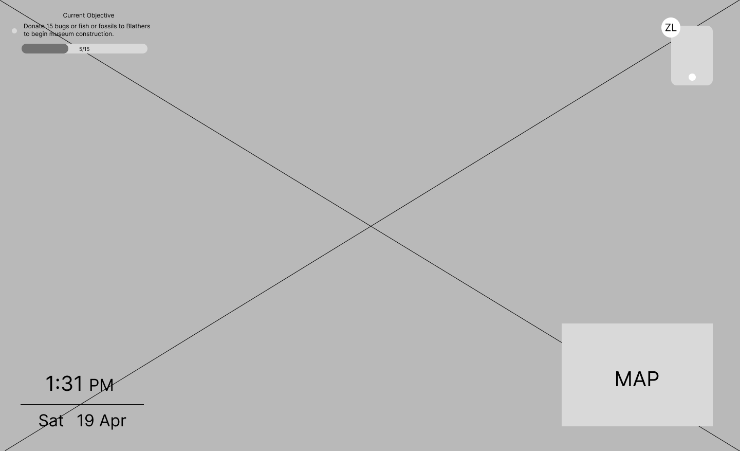


Added Feature
- Added profile card to let player know what island they're playin on.
- Added event awareness banner to display any special events.
Added Feature
- Objective display on the top left
Added Feature
- Notification icons on apps with updates.
Added Feature
- Search bar on top left
Added Feature
- Sort button
- Details button and UI screen
Designing with players, not just for them.
I conducted a usability test using A/B comparisions of the original and redesigned interfaces. By observing how players completed tasks and listening to their feedback, I gained valuable insights that helped validate and refine my design choices.
Key Takeaway
Both experienced and new players preferred the redesigned UI. They found version B easier and faster to use for the tasks they were presented with. In the original UI, players were okay with it because they were familiar with the experience, but when presented with version B, they were more efficient in doing the tasks. Overall I found that players responded positively to the UI improvements without sacrificing the game’s charm.

Setting the Tone
This style guide includes typography, color choices, and visual references from the game. This ensured the redesign to stay true to the original feel.

Designing for Everyone: Accessibility Check
To ensure my UI designs were inclusive, I tested each screen for color blindness accessibility using the Coblis Color Blindness Simulator. This helped me verify that key information remained clear and distinguishable for players with various types of color vision deficiency.

New Horizons, New UI
These final screens reflect the improved UI based on user feedback and usability testing — keeping the spirit of Animal Crossing intact while making everyday tasks more seamless.

Retrospective
What went well
This was my first video game UX/UI project as part of ELVTR's certification course, and I'm proud of the work I was able to accomplish. I learned how to switch gears when designing for a video game vs. designing screens for a mobile or web app. For example, taking the time to understand how players move through the game helped guide my design decisions. This whole course and project went well for me because I got to combine my passion for video games and UX. This made it really rewarding to see my final designs in one of my favorite video games.
Challenges
One of the biggest challenges I faced during this project was learning Photoshop to create the UI mockups. Since I only worked with mobile and web apps before this project, I found it challenging to use Photoshop for my designs. I used this as an oppotunity to get better at a new design tool, so I created all the UI mockups from scratch. But after stepping outside of my comfort zone and learning a new workflow, I found a new tool that will help me grow as a designer. On top of that, designing for a video game was a whole new experience compared to working on mobile or web apps.
Future Considerations
Moving forward, I want to keep improving my visual design skills refine my skills with Photoshop. I'd also want to do more video game UX/UI projects and continue learning how to become a better designer for players.